

Marco Rubio Criticizes State Department’s Common Font for Lacking Decorum
Marco Rubio in Washington, DC, on January 15, 2025.
Credit :
ANDREW CABALLERO-REYNOLDS/AFP via Getty
NEED TO KNOW
- Former Secretary of State Antony J. Blinken decided during President Joe Biden’s administration that the State Department would use Calibri as the official communications font.
- Current Secretary of State Marco Rubio announced on December 9 that the department would return to using Times New Roman.
- Rubio stated the decision was made “to restore decorum and professionalism.”
Secretary of State Marco Rubio has reversed a key decision made by his predecessor regarding the State Department’s official communications font. In a memo issued on December 9, Rubio announced that the department would transition from the sans-serif font Calibri back to Times New Roman as its standard typeface, according to The New York Times.
Rubio’s memo emphasized that this change aims “to restore decorum and professionalism to the Department’s written work products and abolish yet another wasteful D.E.I.A. [Diversity, Equity, Inclusion and Accessibility] program.” He noted that the formatting choice aligns with the President’s directive for a unified voice in all communications, as reported by Reuters.
Antony J. Blinken, former Secretary of State under President Joe Biden, adopted Calibri in 2023 to enhance accessibility for those with disabilities. Research from a 2022 study by the National Institutes of Health indicates that sans-serif fonts are easier to read for many individuals.
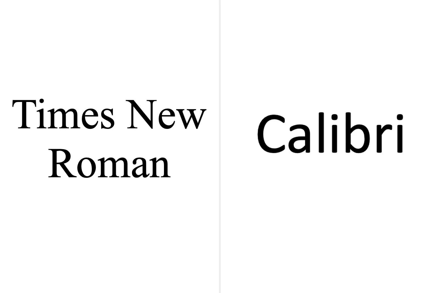
Times New Roman versus Calibri font.
In his memo, Rubio criticized the switch to Calibri, claiming it had “achieved nothing except the degradation of the department’s official correspondence.” He pointed out that serif fonts like Times New Roman are commonly used by the White House and Supreme Court, and are often associated with tradition and formality.
Alongside reverting to Times New Roman, Rubio also adjusted the font size from Blinken’s 15-point requirement to 14-point.
Times New Roman served as the department’s official typeface for nearly two decades, replacing Courier New in 2004. The font was first designed by Victor Lardent and typographic adviser Stanley Morison for the Times of London newspaper in 1932, while Calibri was created by designer Lucas de Groot in 2004.
The State Department has yet to respond to requests for comment regarding this decision.